
Venezuelan-Born artist Maia Benaim moved to Brooklyn to study graphic design at the renowned Pratt Institute. As she builds her portfolio of work, she finds inspiration in the people she’s surrounded by here in New York. We caught up with the versatile designer to tell us about her work and her goals.
How would you describe your artwork?
MB: A lot of people describe my design as minimalistic. But, I wouldn’t describe my design as minimal yet. In my opinion, only people that have been in the field for a long, long, LONG time can master minimalism. You need to know so much to be able to choose so little and still communicate your message. My style, as it is right now, is clean, bold and meticulous.
Is there a work of yours that you think really defines you as an artist?
MB: My design has evolved so fast – almost violently – that what actually defines me as an artist is how versatile I can be. I think that when you’re a graphic designer you have to be like a chameleon. I mean, why would 2 companies want 2 brand identities that look slightly similar. I really try to create a whole different aesthetic for every single project I work on, but I also try to to keep it consistent with my own taste.
But, in terms of one specific project, many of my clients have pointed to the look of The Canopy Project, a campaign I art directed for Earth Day Network in 2017. So as a designer, I would say that one, but as a visual artist, maybe I haven’t made that one piece yet.
What inspires your work?
MB: People. I’m obsessed with humans and I would say my #1 inspiration is is everyone. Even terrible people, they inspire strong feelings that naturally become art sources.
As an artist, what is your favorite medium?
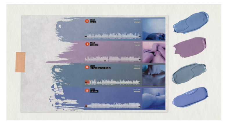
MB: I would say that right now it is digital design. I’m also in love with book design. A bounded stack of papers, I just love it so much. It’s so amazing to compile pages together and send out a feeling. I love how books, magazines, fanzines travel and are always ready to be held. The dimensions of pages, materials, weights, binding methods, how every book gets distributed in different ways. I’ve been making a lot of booklets – personal and for clients – and I can definite say I’m in a curiosity stage.

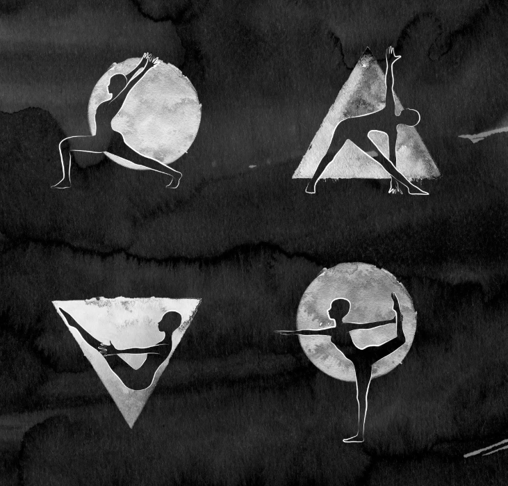
Tell me about this branding project you worked on for Tam Kamya.
MB: That project was so fun. Tam has been one of my favorite yoga teachers, and that’s because she really embodies Eastern philosophies and the true essence of yoga, which is meditation. When she asked me to do her art, it made sense to make it as a book with chapters instead of “services”. I really wanted to stay away from the classic yoga branding aesthetic. We gave her website life by making these chapters about offerings that Tam has: Reiki, chanting, bhakti, etc.

When we met to talk about her branding, she said “this is going to sound weird but I prefer textures over colors.” That is why the predominant palette of that project is indeed textures. We also included yellow as the primary color because it is associated with the Third Chakra. The Third Chakra or the Solar plexus chakra is known as the Manipura Chakra in Sanskrit. the Manipura Chakra is responsible for ‘pearls of wisdom’, well being, clarity and common sense in every individual. The typeface is inspired by a typewriter, and all the drawings are inspired by chalk drawings. Tam and I became so close with that project and I learned so much about the origins of yoga.
What is your goal for your work going forward?
In the future I would love open a branding studio where everything is done in-house, from the naming to the brand strategy and everything in between. I’d love to work with amazing designers and art directors and explore a more human-centered design.
In the meantime (because I know I have lots of homework to do before I get to that point), I want to work closely with established and emerging artists, One day I’d like to start an artist collective to support music, design, media and art. This is a project that I put under my pillow every single night–it’s called MDMA (music design media art, obviously). The idea would be to make it a multidimensional platform: publications, actual parties, gallery openings, workshops,and all made from artist to artist. New York is the city to dream big in, but it can be exhausting. I know it will happen soon though. It’s exciting!
To see more of Maia’s work, follow @maiaben www.maiabenaim.com
Artwork is courtesy of and by Maia Benaim

 Splash Magazines
Be the first to comment